A Pareto chart is a statistical tool used to identify the most common problems or causes of problems in a given process. It is based on the Pareto principle, which states that approximately 80% of problems are caused by 20% of the possible causes. This principle is often referred to as the "80/20 rule." Pareto charts are commonly used in quality control and six sigma initiatives to analyze data and identify areas for improvement.
1. What is a Pareto Chart?
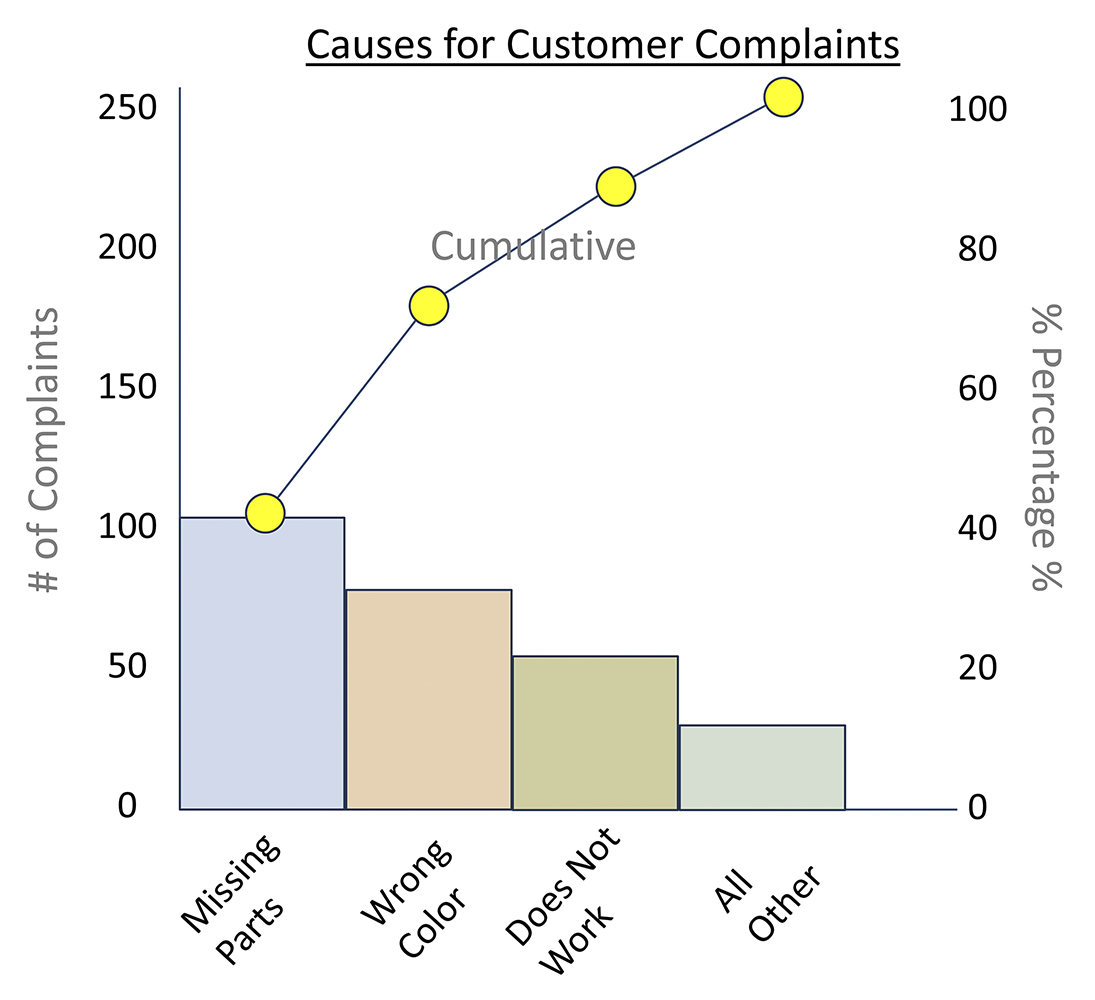
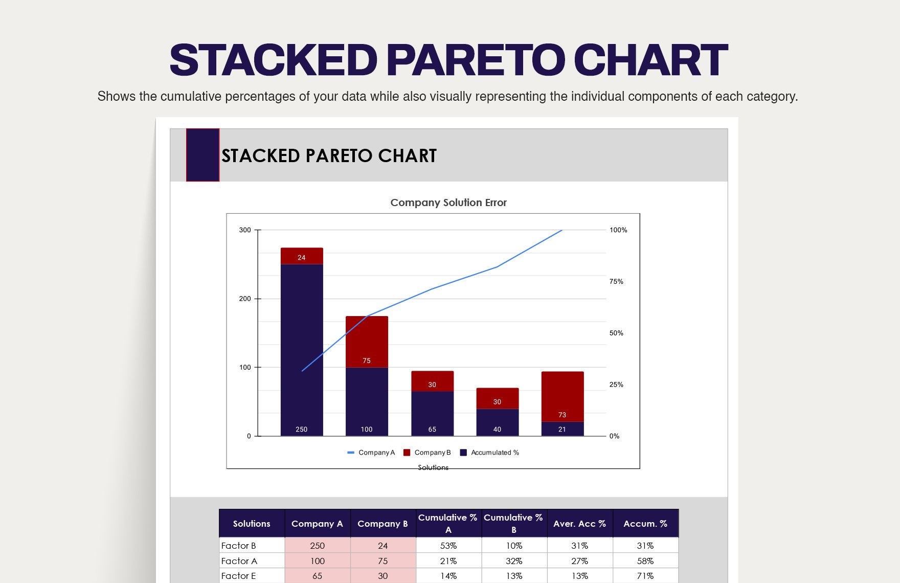
A Pareto chart is a bar graph that displays the relative frequency or size of items in a dataset. The chart is typically sorted in descending order, with the most common items on the left and the least common items on the right. The chart also includes a cumulative percentage line that shows the total percentage of items accounted for by the bars to the left of a given point.
2. Purpose of a Pareto Chart
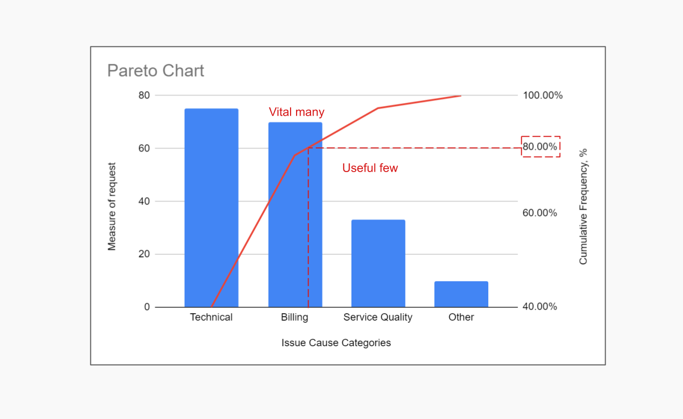
The primary purpose of a Pareto chart is to help identify the most significant problems or causes of problems in a process. By analyzing the chart, users can determine which issues are having the greatest impact and prioritize their efforts accordingly. This can help to maximize the effectiveness of improvement initiatives and minimize waste.
3. Components of a Pareto Chart
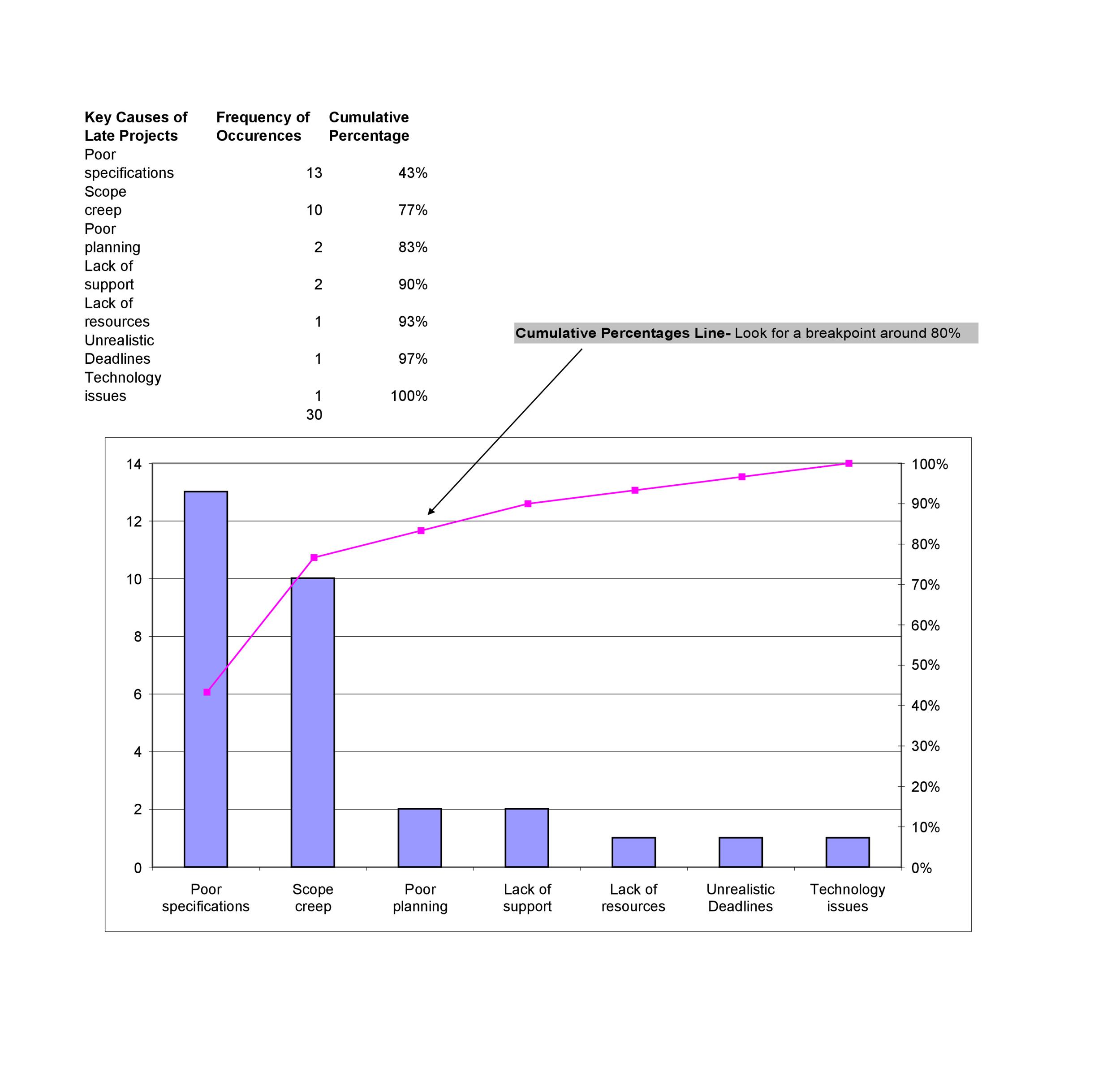
A typical Pareto chart consists of two main components: the bar graph and the cumulative percentage line. The bar graph displays the frequency or size of each item in the dataset, while the cumulative percentage line shows the total percentage of items accounted for by the bars to the left of a given point. The chart may also include additional features, such as labels and titles, to provide context and clarity.
4. How to Create a Pareto Chart
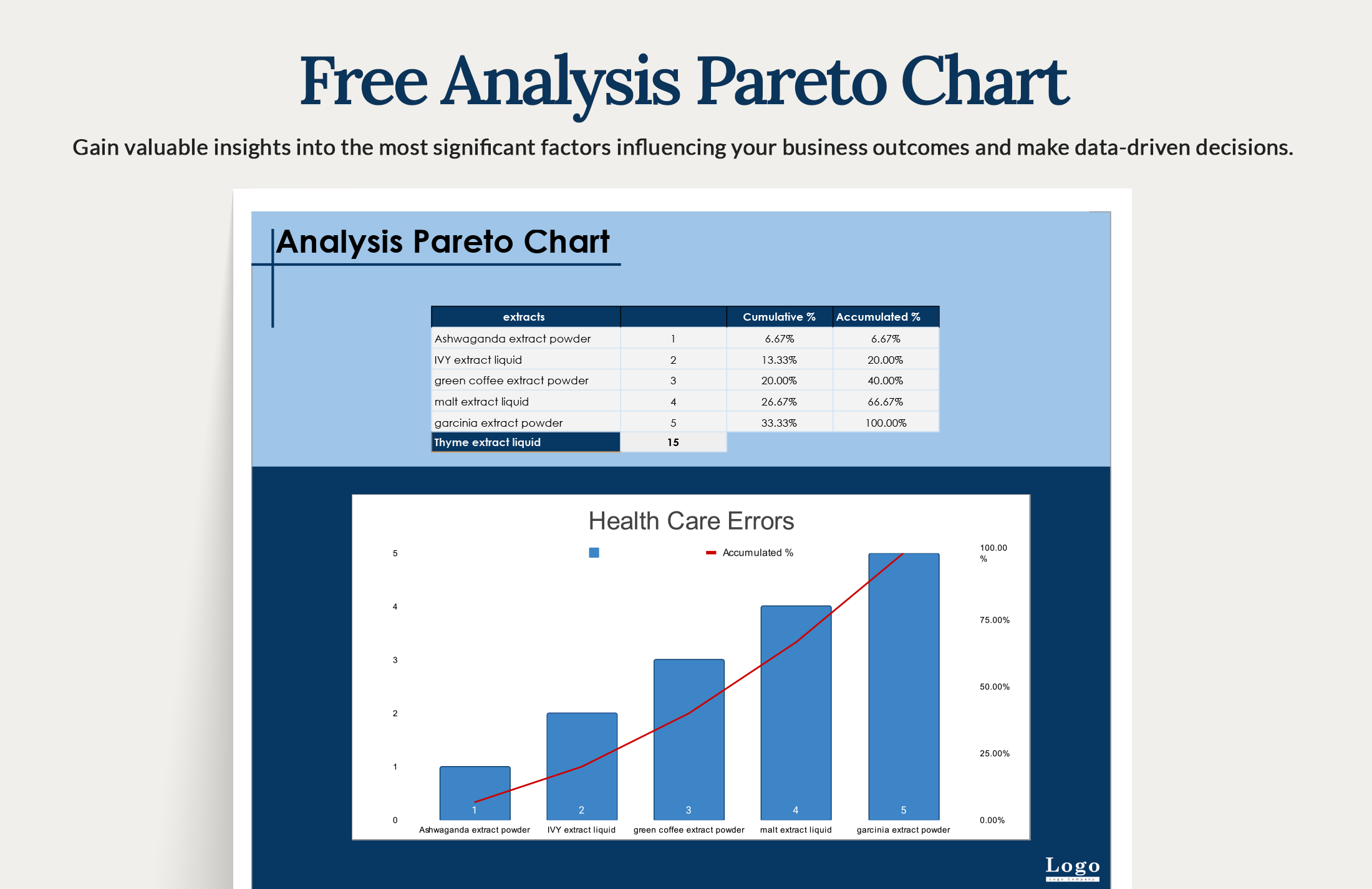
Creating a Pareto chart involves several steps, including collecting and sorting the data, calculating the frequencies or sizes of each item, and plotting the data on a graph. The chart can be created using a variety of tools, including spreadsheet software, statistical analysis software, or online charting tools. The key is to ensure that the data is accurate and reliable, and that the chart is properly formatted and labeled.
5. Interpreting a Pareto Chart
Interpreting a Pareto chart involves analyzing the data and identifying the most significant problems or causes of problems. The chart can be used to determine which issues are having the greatest impact, and to prioritize efforts accordingly. The cumulative percentage line can be used to determine the point at which the majority of problems are accounted for, which is often referred to as the " Pareto point."
6. Benefits of a Pareto Chart
Pareto charts offer several benefits, including the ability to quickly and easily identify the most significant problems or causes of problems. They can also help to prioritize efforts and maximize the effectiveness of improvement initiatives. Additionally, Pareto charts can be used to track progress over time and evaluate the effectiveness of changes made to a process.
7. Common Applications of Pareto Charts
Pareto charts are commonly used in a variety of applications, including quality control, six sigma initiatives, and process improvement. They can be used to analyze data from any process or system, and are particularly useful for identifying and addressing problems in complex systems. Pareto charts are also used in business and finance to analyze customer complaints, defect rates, and other types of data.
8. Limitations of a Pareto Chart
While Pareto charts are a powerful tool for analyzing data and identifying problems, they do have some limitations. For example, they are typically based on historical data, and may not reflect current or future conditions. Additionally, Pareto charts can be misleading if the data is not accurate or reliable, or if the chart is not properly formatted and labeled.
9. Best Practices for Using Pareto Charts
To get the most out of a Pareto chart, it is essential to follow best practices for creating and interpreting the chart. This includes ensuring that the data is accurate and reliable, properly formatting and labeling the chart, and using the chart to prioritize efforts and track progress over time. It is also important to consider the limitations of the chart and to use it in conjunction with other tools and techniques.
10. Conclusion
In conclusion, Pareto charts are a powerful tool for analyzing data and identifying problems in a process. By following best practices for creating and interpreting the chart, users can maximize the effectiveness of their improvement initiatives and minimize waste. Whether used in quality control, six sigma initiatives, or process improvement, Pareto charts can help to identify the most significant problems and prioritize efforts accordingly.
If you are looking for Pareto Chart - Kaufman Global Pareto Analysis and Pareto Principle you've came to the right page. We have 10 Pics about Pareto Chart - Kaufman Global Pareto Analysis and Pareto Principle like Pareto Chart Template - astra.edu.pl, Pareto Chart for Lean teams and also Pareto Chart Template - astra.edu.pl. Here it is:
Pareto Chart - Kaufman Global Pareto Analysis And Pareto Principle
 www.kaufmanglobal.com
Pareto Chart - Kaufman Global Pareto Analysis and Pareto Principle
Pareto Chart Template - Astra.edu.pl
 astra.edu.pl
Pareto Chart Template - astra.edu.pl
25 Best Pareto Chart Excel Template - RedlineSP
 www.redlinesp.net
25 Best Pareto Chart Excel Template - RedlineSP
What Is A Pareto Chart? How To Create It In Excel?
 planyway.com
What is a Pareto Chart? How to Create it in Excel?
Pareto Chart For Lean Teams
 www.iobeya.com
Pareto Chart for Lean teams
Pareto Chart Template - Astra.edu.pl
 astra.edu.pl
Pareto Chart Template - astra.edu.pl
Pareto Chart Template - Astra.edu.pl
 astra.edu.pl
Pareto Chart Template - astra.edu.pl
Pareto Chart Template - Astra.edu.pl
 astra.edu.pl
Pareto Chart Template - astra.edu.pl
Pareto Chart Template - Astra.edu.pl
 astra.edu.pl
Pareto Chart Template - astra.edu.pl
25 Pareto Chart Excel Template | RedlineSP
 www.redlinesp.net
25 Pareto Chart Excel Template | RedlineSP
Pareto chart for lean teams. Pareto chart template. pareto chart template

