Pareto chart analysis is a powerful tool used in quality control and management to identify the most common problems or causes of problems within a process. It's based on the Pareto principle, also known as the 80/20 rule, which states that approximately 80% of problems are caused by 20% of the possible causes. This principle helps in prioritizing efforts to maximize the impact of improvements. By applying Pareto chart analysis, organizations can streamline their processes, reduce waste, and improve overall efficiency. Here are the key aspects of Pareto chart analysis:
1. Understanding the Pareto Principle
The Pareto principle is fundamental to understanding how Pareto chart analysis works. It suggests that a small proportion of causes or inputs are responsible for a disproportionately large proportion of the results or outputs. This principle guides the creation and interpretation of Pareto charts, helping teams focus on the most significant issues first.
2. Identifying the Problems
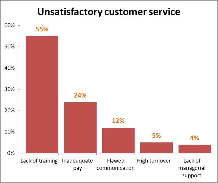
The first step in Pareto chart analysis is to clearly identify the problems or areas of improvement within a process. This involves collecting data on the frequency or impact of different types of defects, errors, or issues. The problems should be specific, measurable, and relevant to the process being analyzed.
3. Collecting and Categorizing Data
After identifying the problems, the next step is to collect and categorize data related to these issues. The data should be detailed enough to allow for the classification of problems into distinct categories. This step is critical as it forms the basis of the Pareto chart, which will visually represent the frequency or impact of each category of problems.
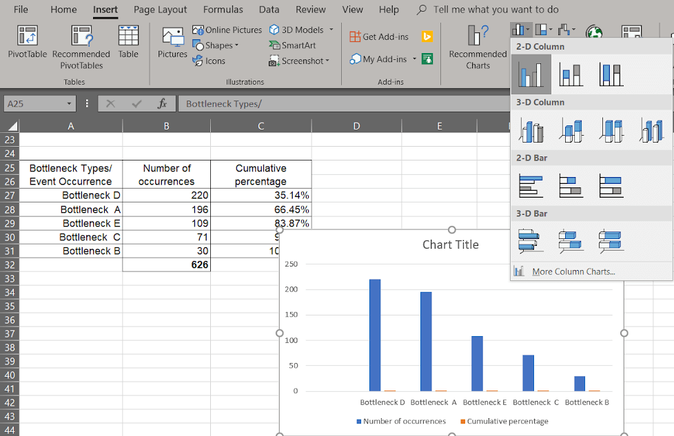
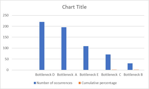
4. Creating the Pareto Chart
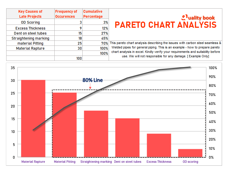
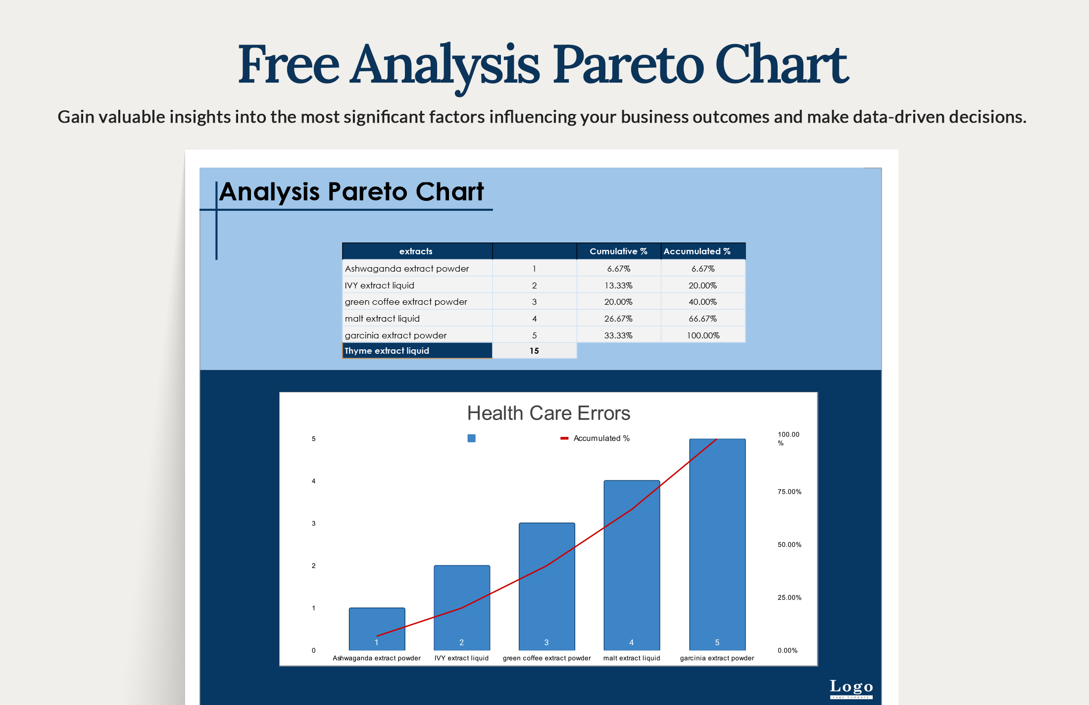
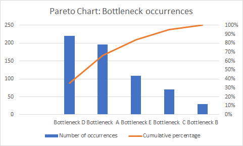
A Pareto chart is a bar chart that displays the relative frequency or size of items, with the largest items first. To create a Pareto chart, the data collected is plotted with the categories of problems on the x-axis and their frequencies or impacts on the y-axis. The bars are arranged in descending order, with the most significant problems on the left.
5. Analyzing the Chart
Once the Pareto chart is created, the next step is to analyze it. This involves looking at the chart to identify which problems are most significant and where efforts should be focused to achieve the greatest improvement. The analysis also considers the cumulative percentage of problems, often shown as a line graph alongside the bars, to highlight the point at which the majority of the problems are accounted for.
6. Setting Priorities
Based on the analysis of the Pareto chart, priorities are set for addressing the problems. The principle guides teams to focus first on the problems that are responsible for the largest portion of the issues, as these will have the greatest impact when solved. This systematic approach ensures that resources are allocated efficiently.
7. Implementing Solutions
With priorities set, the next step is to implement solutions for the most significant problems. This involves developing and executing plans to address these issues, which could range from adjusting processes to providing additional training. The solutions should be measurable and have clear objectives to ensure they are effective.
8. Monitoring Progress
After implementing solutions, it's essential to monitor progress. This involves collecting new data to see if the frequency or impact of the problems has decreased as a result of the actions taken. If the desired outcomes are not achieved, further analysis and adjustments may be necessary.
9. Continuous Improvement
Pareto chart analysis is not a one-time activity but part of a continuous improvement process. As changes are made and processes improve, new problems may arise, or the significance of existing issues may change. Regularly applying Pareto chart analysis helps in identifying and addressing these evolving challenges, leading to ongoing improvement.
10. Integrating with Other Tools and Techniques
Finally, Pareto chart analysis is often used in conjunction with other quality control tools and techniques, such as the Five Whys, Fishbone diagrams, and root cause analysis. Integrating Pareto chart analysis into a broader quality management system enhances its effectiveness, providing a comprehensive approach to problem-solving and process improvement.
If you are looking for How to Do Pareto Chart Analysis with Practical Examples — Tallyfy you've visit to the right web. We have 10 Pictures about How to Do Pareto Chart Analysis with Practical Examples — Tallyfy like All About Pareto Chart and Analysis - Pareto Chart, Free Analysis Pareto Chart - Google Sheets, Excel | Template.net and also All About Pareto Chart and Analysis - Pareto Chart. Read more:
How To Do Pareto Chart Analysis With Practical Examples — Tallyfy
 tallyfy.com
How to Do Pareto Chart Analysis with Practical Examples — Tallyfy
How To Do Pareto Chart Analysis With Practical Examples — Tallyfy
 tallyfy.com
How to Do Pareto Chart Analysis with Practical Examples — Tallyfy
Pareto Chart Analysis Results. | Download Scientific Diagram
 www.researchgate.net
Pareto chart analysis Results. | Download Scientific Diagram
Pareto Chart Analysis | Download Scientific Diagram
 www.researchgate.net
Pareto Chart Analysis | Download Scientific Diagram
Pareto Chart Analysis
 www.qualitybook.org
Pareto Chart analysis
How To Do Pareto Chart Analysis With Practical Examples
 tallyfy.com
How to Do Pareto Chart Analysis with Practical Examples
Free Analysis Pareto Chart - Google Sheets, Excel | Template.net
 www.template.net
Free Analysis Pareto Chart - Google Sheets, Excel | Template.net
All About Pareto Chart And Analysis - Pareto Chart
 www.pareto-chart.com
All About Pareto Chart and Analysis - Pareto Chart
How To Do Pareto Chart Analysis With Practical Examples
 tallyfy.com
How to Do Pareto Chart Analysis with Practical Examples
How To Do Pareto Chart Analysis With Practical Examples — Tallyfy
 tallyfy.com
How to Do Pareto Chart Analysis with Practical Examples — Tallyfy
How to do pareto chart analysis with practical examples — tallyfy. All about pareto chart and analysis. How to do pareto chart analysis with practical examples — tallyfy

