When it comes to data visualization, two types of charts are often confused with each other: histograms and bar charts. While they may look similar at first glance, they serve different purposes and are used to display different types of data. In this article, we'll dive into the differences between histograms and bar charts, and explore when to use each. Whether you're a data analyst, a researcher, or simply someone who wants to better understand data visualization, this article is for you.
1. Definition and Purpose
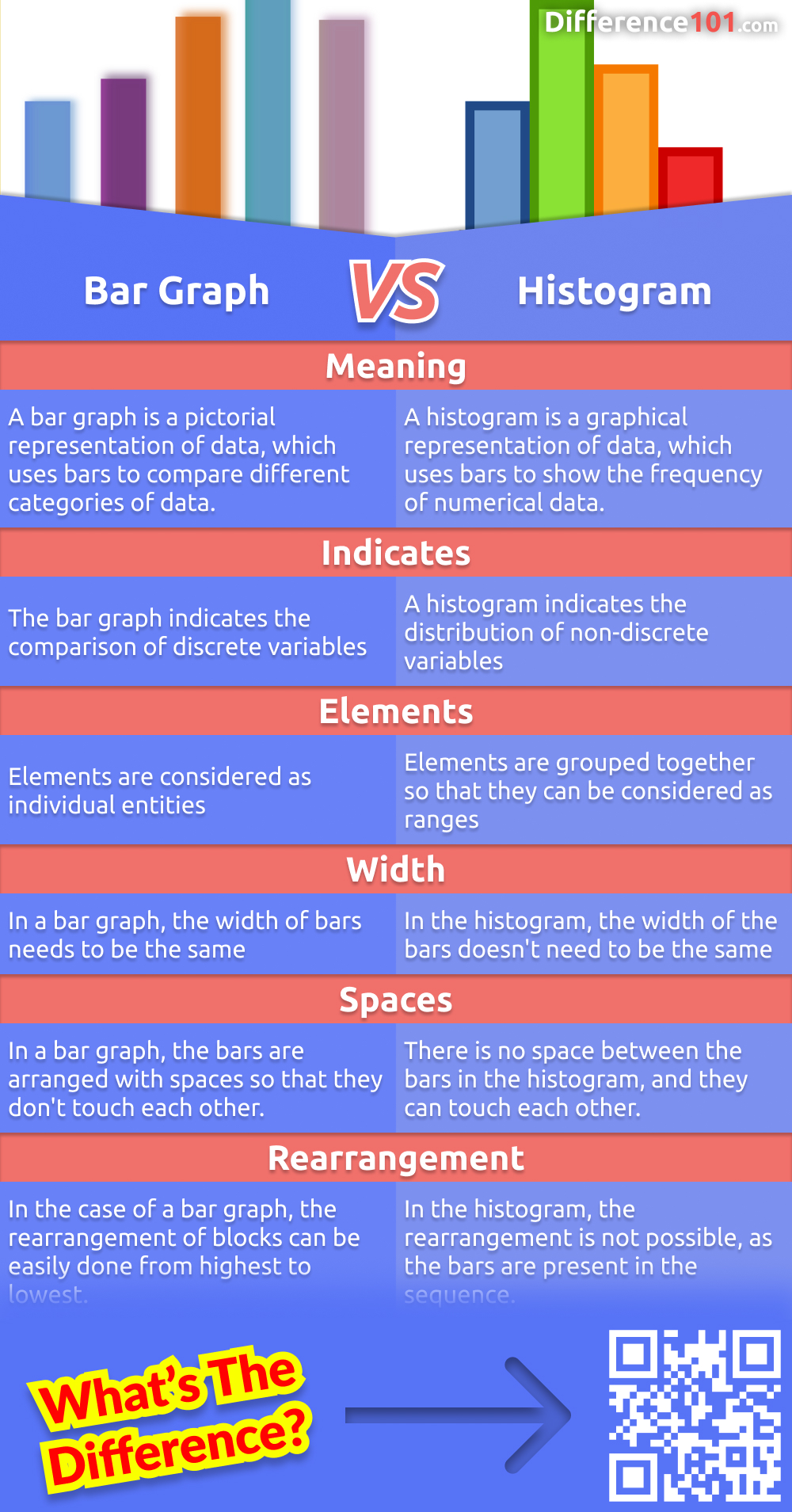
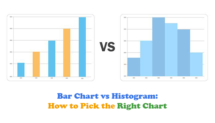
A histogram is a type of chart that is used to display the distribution of continuous data, such as the height of people, the weight of objects, or the temperature of a room. Its purpose is to show the frequency or density of data points within a specific range. On the other hand, a bar chart is used to compare the values of different categories, such as the sales of different products or the popularity of different websites. The main difference between the two is that histograms are used to show the distribution of data, while bar charts are used to compare the values of different categories.
2. Data Type
Histograms are typically used with continuous data, which can take any value within a range. For example, the height of a person can be 170.5 cm, 171.2 cm, or any other value. Bar charts, on the other hand, are often used with categorical data, which can only take certain values. For example, the color of a car can be red, blue, or green, but it can't be 170.5 cm. This difference in data type is what sets histograms and bar charts apart.
3. Bin Size
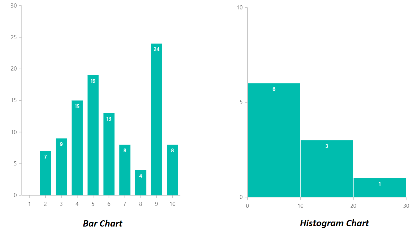
In a histogram, the data is grouped into bins, which are ranges of values. The bin size determines how many data points are included in each bin. For example, if we're creating a histogram of exam scores, we might group the scores into bins of 10 points each (e.g., 0-10, 11-20, etc.). The bin size can greatly affect the appearance of the histogram and the insights we can gain from it. In contrast, bar charts do not have bins, as each bar represents a single category.
4. Axis Labels
The axis labels of a histogram and a bar chart also differ. In a histogram, the x-axis typically represents the value of the data, while the y-axis represents the frequency or density of the data. In a bar chart, the x-axis represents the categories, while the y-axis represents the values of those categories. This difference in axis labels reflects the different purposes of the two types of charts.
5. Skewness and Outliers
Histograms are particularly useful for showing the skewness of data, which refers to the asymmetry of the distribution. If the data is skewed to one side, the histogram will show a long tail on that side. Bar charts, on the other hand, do not show skewness as clearly. Additionally, histograms can help identify outliers, which are data points that are far away from the rest of the data. Bar charts can also show outliers, but they are less effective at doing so.
6. Comparison of Categories
Bar charts are ideal for comparing the values of different categories. For example, we might use a bar chart to compare the sales of different products or the popularity of different websites. Histograms, on the other hand, are not well-suited for comparing categories, as they are designed to show the distribution of continuous data.
7. Visual Representation
The visual representation of histograms and bar charts also differs. Histograms typically have a continuous range of values on the x-axis, while bar charts have distinct categories. This difference in visual representation can make it easier to understand the data and gain insights from it. Additionally, histograms often have a more fluid and continuous appearance, while bar charts have a more discrete and separated appearance.
8. Data Density
Histograms can show the density of data, which refers to the concentration of data points within a specific range. This can be particularly useful when dealing with large datasets, as it can help identify patterns and trends. Bar charts, on the other hand, do not show data density as clearly, as each bar represents a single category rather than a range of values.
9. Real-World Applications
Histograms and bar charts have many real-world applications. For example, histograms can be used in finance to show the distribution of stock prices or in medicine to show the distribution of patient outcomes. Bar charts can be used in business to compare the sales of different products or in social media to compare the popularity of different posts. Understanding the differences between histograms and bar charts can help us choose the right type of chart for our specific needs.
10. Best Practices
Finally, it's worth noting some best practices for using histograms and bar charts. For histograms, it's often helpful to use a large sample size and to adjust the bin size to get a clear picture of the data. For bar charts, it's often helpful to use clear and concise labels and to avoid using too many categories. By following these best practices and understanding the differences between histograms and bar charts, we can create effective and informative visualizations that help us gain insights from our data.
If you are searching about Bar Chart vs. Histogram | BioRender Science Templates you've visit to the right page. We have 10 Pics about Bar Chart vs. Histogram | BioRender Science Templates like Bar Chart vs. Histogram | BioRender Science Templates, 8 key differences between Bar graph and Histogram chart | Syncfusion and also Bar Chart vs. Histogram | BioRender Science Templates. Read more:
Bar Chart Vs. Histogram | BioRender Science Templates
 www.biorender.com
Bar Chart vs. Histogram | BioRender Science Templates
Bar Graph Vs. Histogram: 6 Key Differences, Pros & Cons, Similarities
 www.difference101.com
Bar Graph vs. Histogram: 6 Key Differences, Pros & Cons, Similarities ...
Differences Between Bar Chart And Histogram
 uchart.web.app
Differences Between Bar Chart And Histogram
Histogram Vs Bar Chart At Hayley Savige Blog
 storage.googleapis.com
Histogram Vs Bar Chart at Hayley Savige blog
Histogram Vs A Bar Chart At Kathleen Delgado Blog
 storage.googleapis.com
Histogram Vs A Bar Chart at Kathleen Delgado blog
Histogram Vs. Bar Graph – Differences And Examples
 mathmonks.com
Histogram vs. Bar Graph – Differences and Examples
Difference Between Histogram And Bar Graph (with Comparison Chart
 keydifferences.com
Difference Between Histogram and Bar Graph (with Comparison Chart ...
What Is The Difference Between A Bar Graph And A Histogram? [SOLVED]
![What is the difference between a bar graph and a histogram? [SOLVED]](https://d138zd1ktt9iqe.cloudfront.net/media/seo_landing_files/screenshot-2021-03-01-at-9-17-06-am-1614570481.png) www.cuemath.com
www.cuemath.com
What is the difference between a bar graph and a histogram? [SOLVED]
Bar Chart Vs Histogram: How To Pick The Right Chart
 chartexpo.com
Bar Chart vs Histogram: How to Pick the Right Chart
8 Key Differences Between Bar Graph And Histogram Chart | Syncfusion
 www.syncfusion.com
8 key differences between Bar graph and Histogram chart | Syncfusion
histogram vs bar chart at hayley savige blog. Histogram vs a bar chart at kathleen delgado blog. Bar chart vs. histogram

